B2B Industry
Best B2B Product Page Design With Examples

-1.png)
When it comes to designing a website, an e-commerce site, for instance, the development of the homepage receives the most attention. The homepage is the face of a website. It is important to make sure that it conveys your brand effectively.
Nevertheless, the main purpose of an e-commerce platform is to convert visitors into customers. Sales are at the heart of every online store. Needless to say, creating product pages that are of the same caliber as your homepage is key to generating profits.
According to recent research, online shoppers are keen on the content, both images and text, that they can source from product pages. In fact, 87% of consumers claim that the quality of the information found on a product page is a deciding factor in their purchases. Likewise, 61% of online consumers say that they need to see at least three images before deciding on the item that they intend to buy.
To explore more about top B2B product page designs, continue reading or navigate to the specific example you're interested in:
1. Clear, Clean, and Concise: Daily Harvest
2. You Aren’t Selling a Product, You Are Selling an Experience: Helix Mattresses
3. Making the First Step the Easiest Step: Shopify
4. It is All in the Hero Statement: Slack
For the most part, an effective product page fulfills three requirements. It must be engaging enough to capture the attention of your audience, it must contain all pertinent information regarding the item you are selling, and lastly, it must convince your potential client to make the purchase. While the requirements might seem daunting, there is a certain finesse that goes into creating a successful product page. Below are a few good examples that you can take cues from:
1. Clear, Clean, and Concise: Daily Harvest
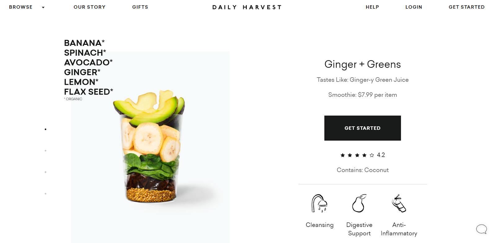
Daily Harvest is a company that offers pre-packaged superfood mixes in the form of smoothies, soups, and other health food products. They offer a hassle-free way to eat healthily with your food being delivered straight to your door.
Like their service, Daily Harvest’s product pages are direct and fizz-free. Aside from the stunning images of the package that you would get as well as the end product that you could expect, it also includes details as to what makes healthy food a superfood. The page has the ingredients, the nutritional facts, as well as, instructions as to how to use the packets in the best way possible.
2. You Aren’t Selling a Product, You Are Selling an Experience: Helix Mattresses
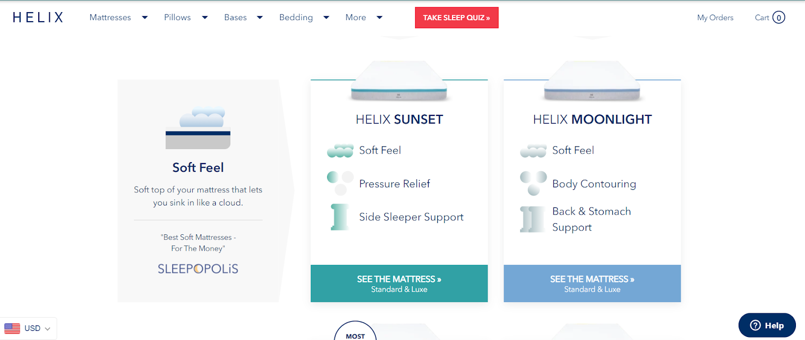
Mattress stores, even online ones, are a dime a dozen. It isn’t all that difficult to find a retailer that can offer you a wide array of mattresses. Helix Mattresses, however, does not just sell mattresses, they sell the idea of a good night’s sleep - at least according to their product pages.
Helix Mattresses’ product pages are a cut above the rest because of their vivid product descriptions. The company knows that it can be difficult to imagine what “soft,” “firm,” or “ergonomic” means, especially when it comes to foam. The content of these pages offers evocative and tactile explanations of their items. Reading through the text allows clients to imagine the mattress that they intend to buy.
3. Making the First Step the Easiest Step: Shopify

People are busy. So busy, that it takes them .05 seconds to form an opinion on a website. Imagine, it takes a visitor less than a second to decide if your business is relevant to their needs. With that said, it is important to make the process of signing up and making a purchase as easy as possible.
Take cues from Shopify. Shopify’s product page features two call-to-action buttons at the first fold of the page. Both of the C2A’s offer a free trial to the page visitors. By limiting the friction required of a potential client to sign up, you are increasing your chances of bagging the sale.
4. It is All in the Hero Statement: Slack
For most people, Slack is nothing more than a workplace chat room wherein you can create custom gag emojis of your colleagues. However, it is important to remember that there is power in the language and the words that you choose for your product page. The copy can change a potential client’s perception of your product.
According to its product page, Slack is the headquarters. It is a platform for collaboration, creation, and growth. It is a place to source information, to get clarification, and to feel like you belong.
In creating product pages, it is important to remember that there isn’t a perfect formula that guarantees results. It is all about taking the three requirements mentioned above and adjusting them to the specific needs of your audience. If you have your target market’s goals, frustrations, wants, and needs in mind while creating your website, it is highly unlikely that you will encounter a lot of issues.

TABLE OF CONTENTS


.png?width=90&height=90&name=facebook%20(1).png)
Stay Updated with Our
Latest Posts
Subscribe now to receive the freshest content, insights, and updates directly in your inbox.
.png?width=94&height=96&name=Vector%20(1).png)
Stay connected with us! Follow The Orange Box for the latest updates, insights, and creative solutions.
Let’s build something amazing together.

2024 © The Orange Box Agency – All rights reserved